Hello,
I am a Sydney based graphic designer and artist.
A little bit about me — I moved to Sydney in 2012 from the UK and it was love at first sight! My design aesthetics are influenced by my travels around Australia, soaking up the vibrant landscapes, flora and fauna, as well as my European upbringing in the UK and Germany. I have a deep appreciation for history and culture, which often informs my design concepts.
If I’m not designing, I’ll be on a road trip or whiling away an afternoon in an art gallery.
Portfolio
EVE Beverages
The Brief
Swedish drinks duo, Eli and Nils, are here to shake up the social scene with their new range of non alcoholic sparkling beverages. They passionately believe that we should not have to sacrifice taste and style to enjoy a party and wake up hangover free.
The identity and packaging design for this range of drinks had to be elevated, fresh and fun.
The Solution
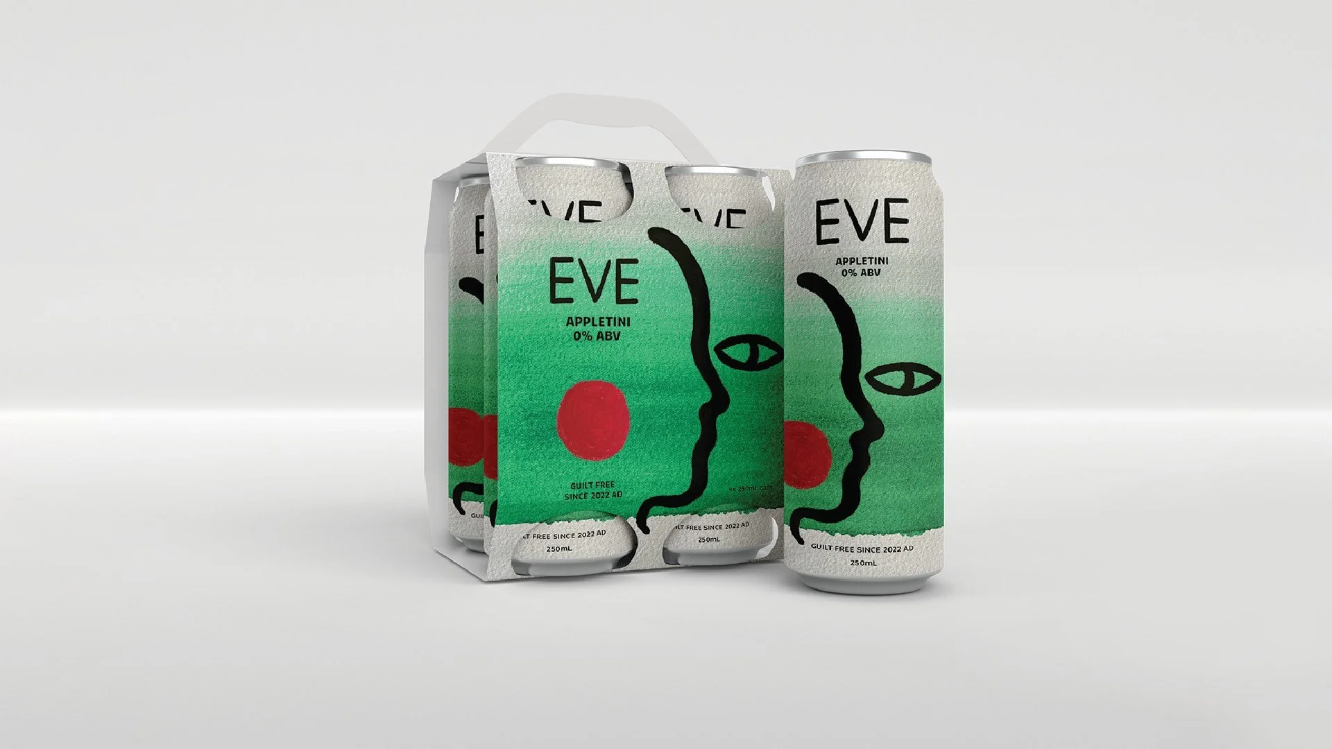
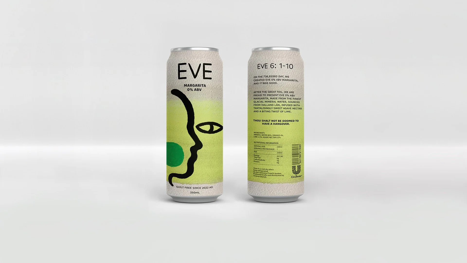
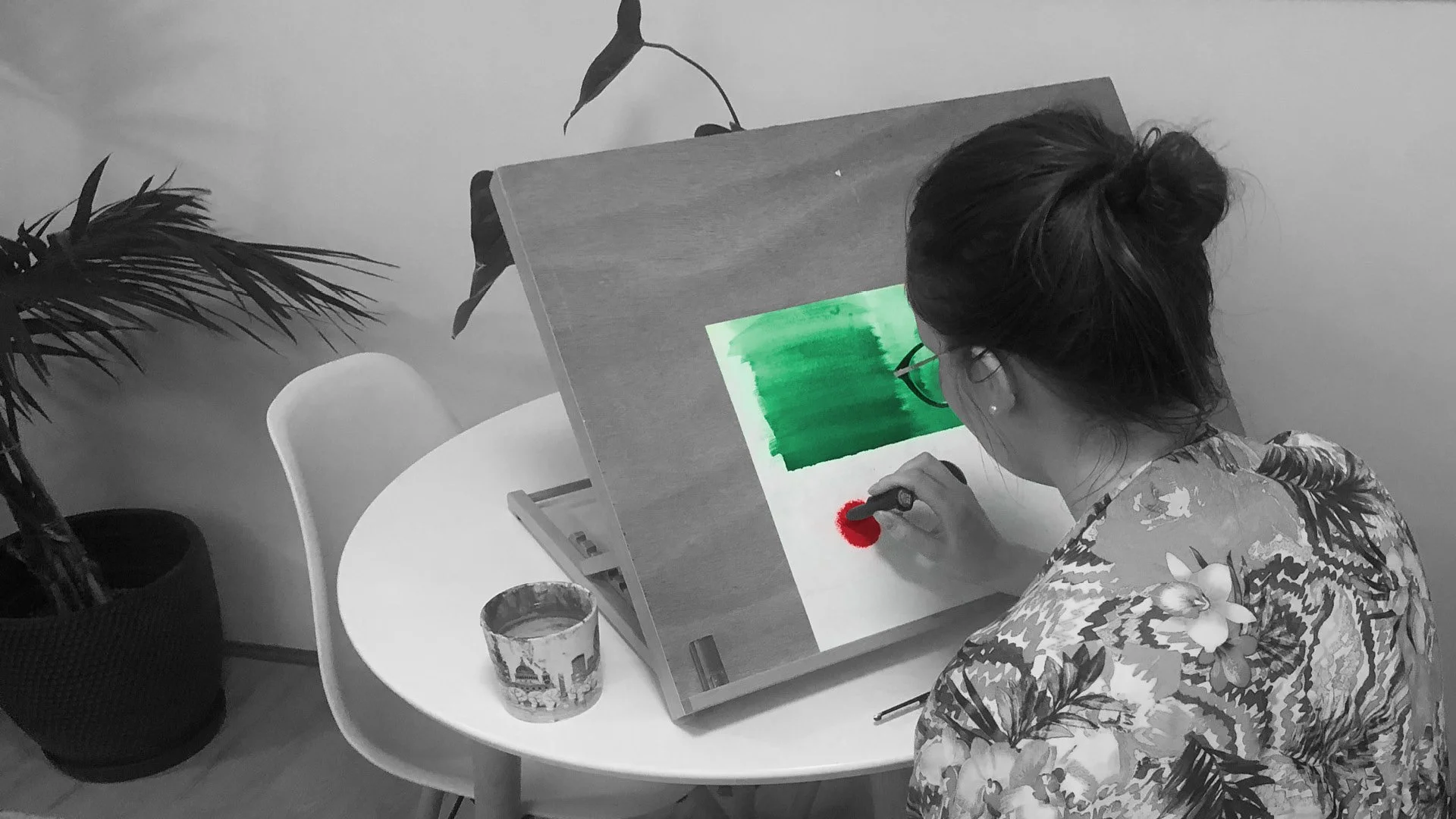
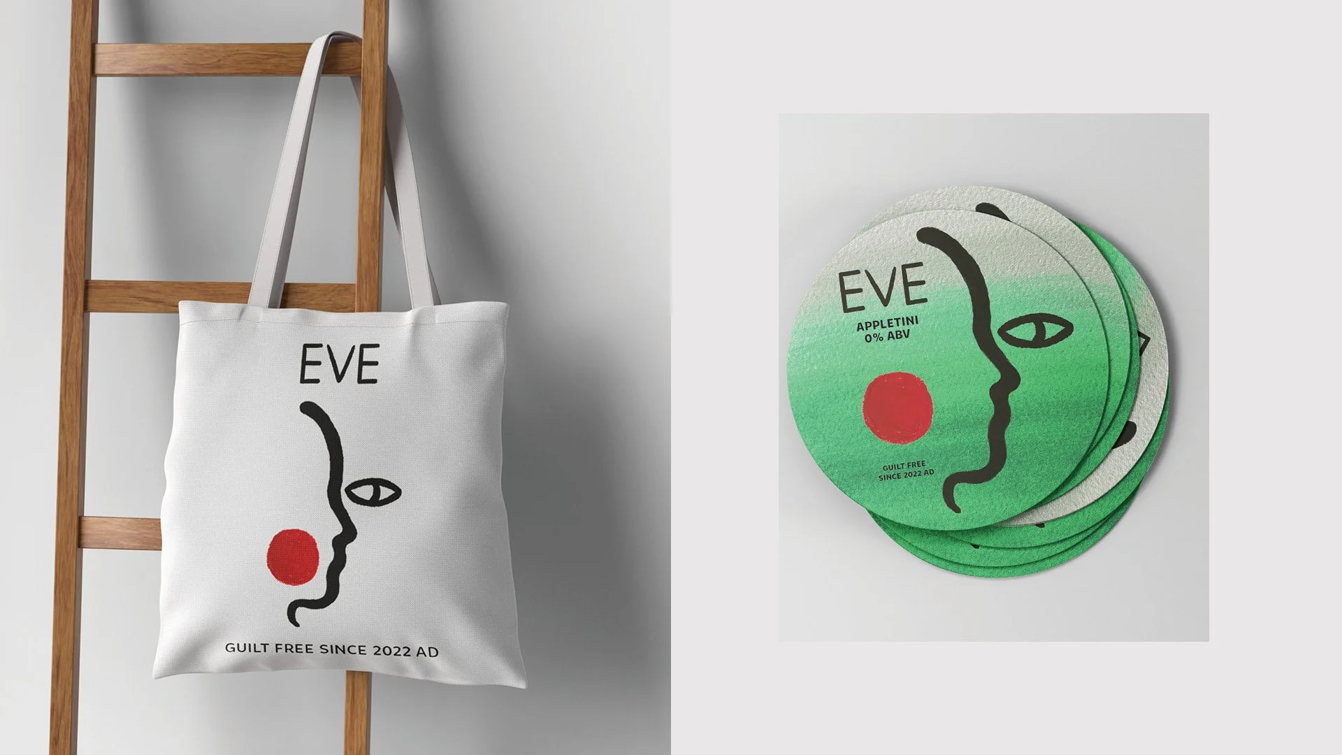
The brand identity 'Eve' plays off the biblical association with guilt and temptation. The packaging design uses fresh, bright colours to invoke the cocktail flavour profiles, whilst the bold illustrations and tone of voice give the brand a sense of 'guilt free' fun. The rough, hand drawn finishes to the illustrations and brand name give a contemporary crafted feel.
FORTE Magazine
The Brief
NME Magazine is a best selling music magazine and a pioneer of gonzo journalism. Established in the 1970s, NME has been online only since 2018. Now they are launching a new quarterly print magazine, which will have its own distinct identity and focus on in-depth, thought provoking articles to target an audience of musos and creatives.
The Solution
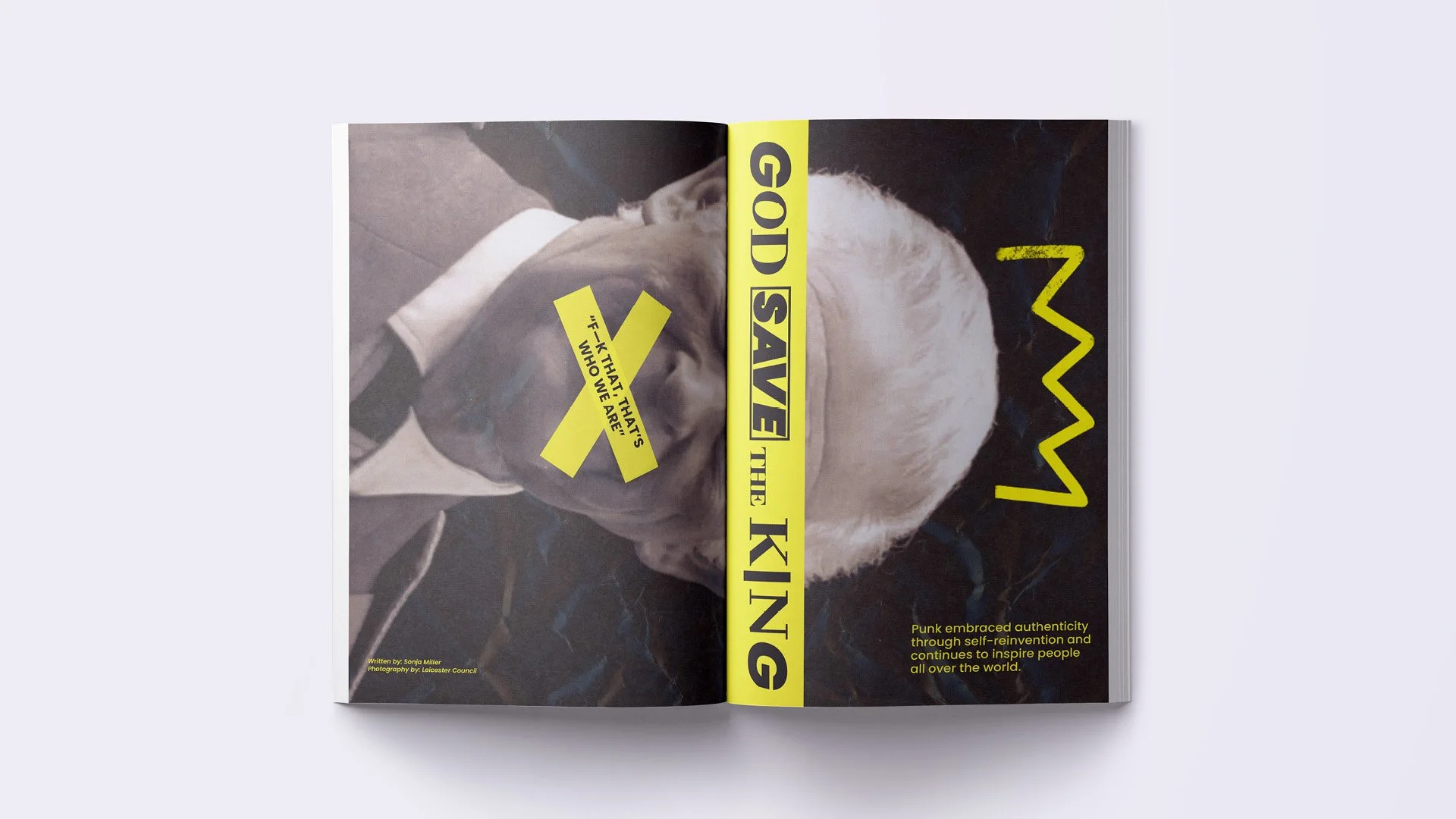
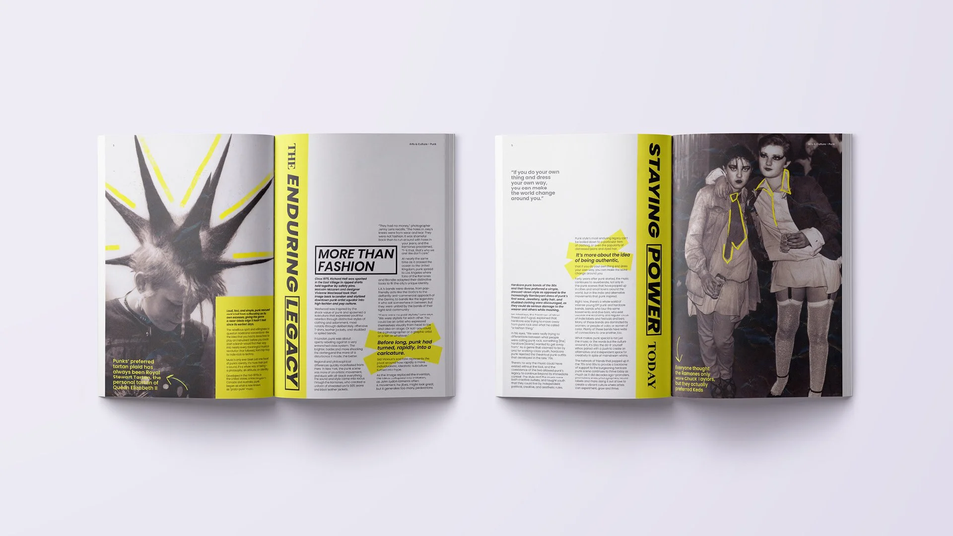
The clean aesthetics of 'Forte' magazine create a separate identity from NME and target the muso and creative audience. In music, Forte is the term for ‘loud’, reflecting magazine’s strong, intentional journalism with a point of view. The magazine name has been adapted into a bold logo mark {F} to create a strong visual identity on shelf and the use of curly braces are a reference to sheet music.
Sara Lee Campaign
The Brief
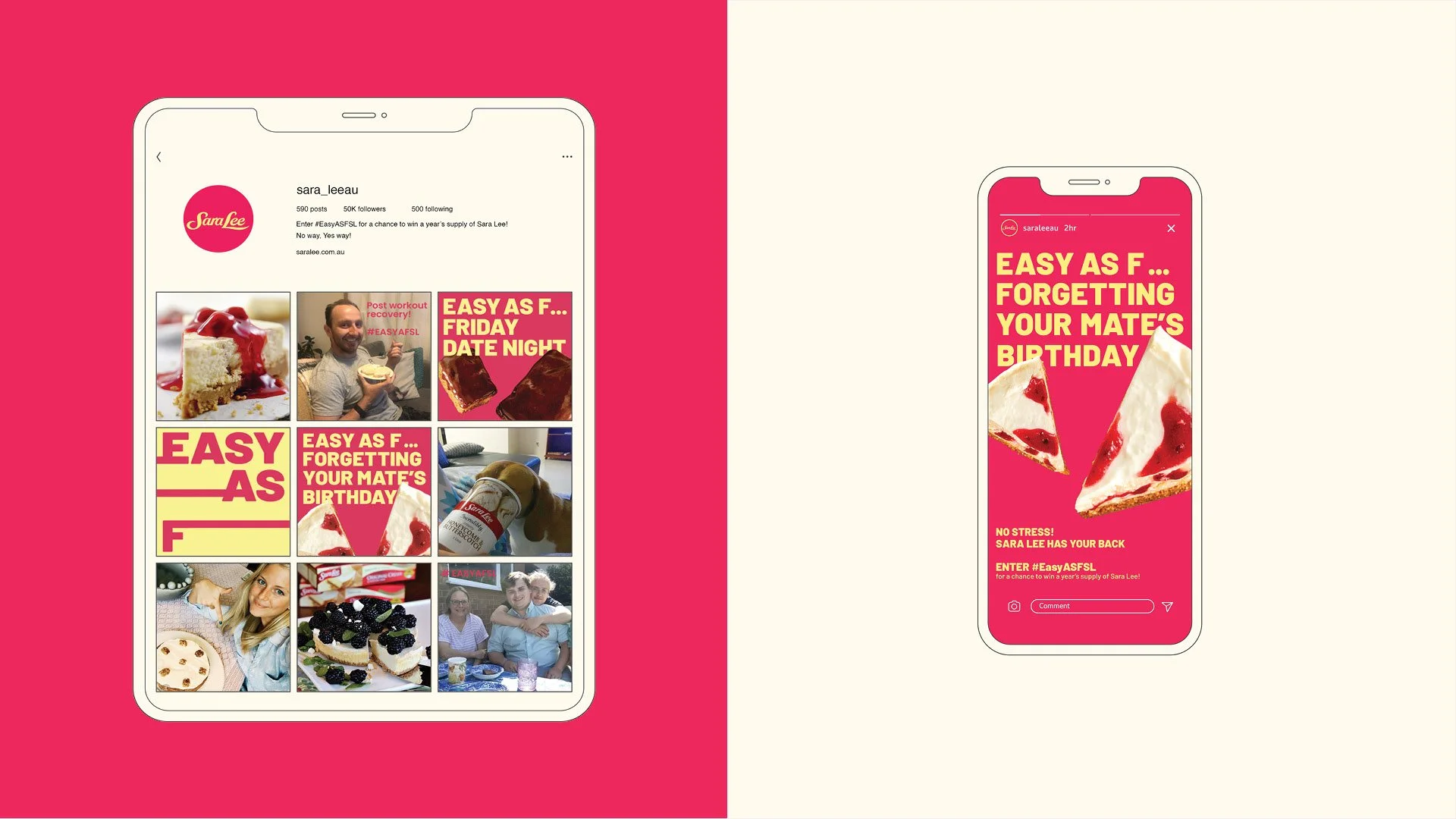
Sara Lee is an iconic frozen dessert brand in Australia since the 1970s. Yet despite having a 96% awareness rating, their sales have been slowing as they struggle to resonate with younger consumers.
This campaign needed to be attention grabbing, youthful and fun to target Millennials and GenZ.
The Solution
What makes Sara Lee unique? It's so easy, readily available in your freezer and can get you out of sticky situations quickly and deliciously!
The humorous, borderline edgy, tone of voice and bold type is attention grabbing and relatable for younger consumers. The campaign is a mix of digital and print, with a focus on social media to reach the target audience and create engagement.
Noodle Museum
The Brief
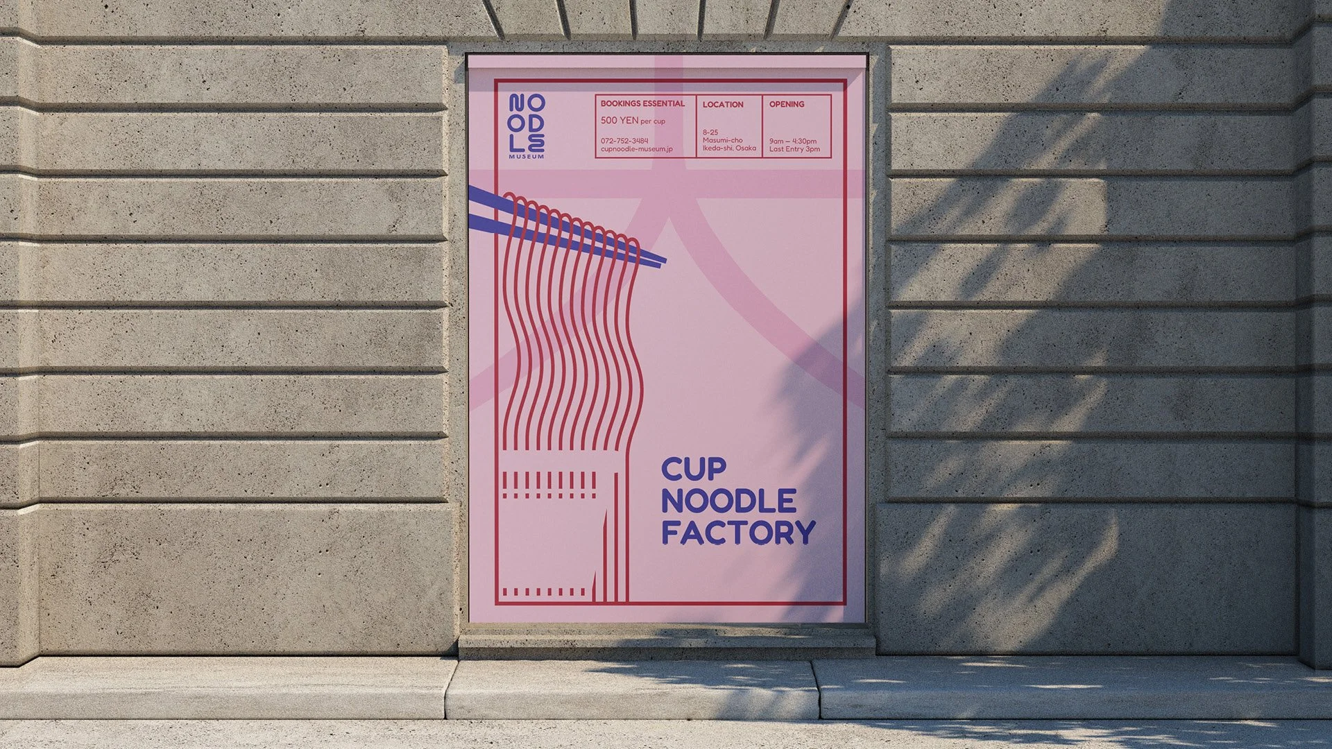
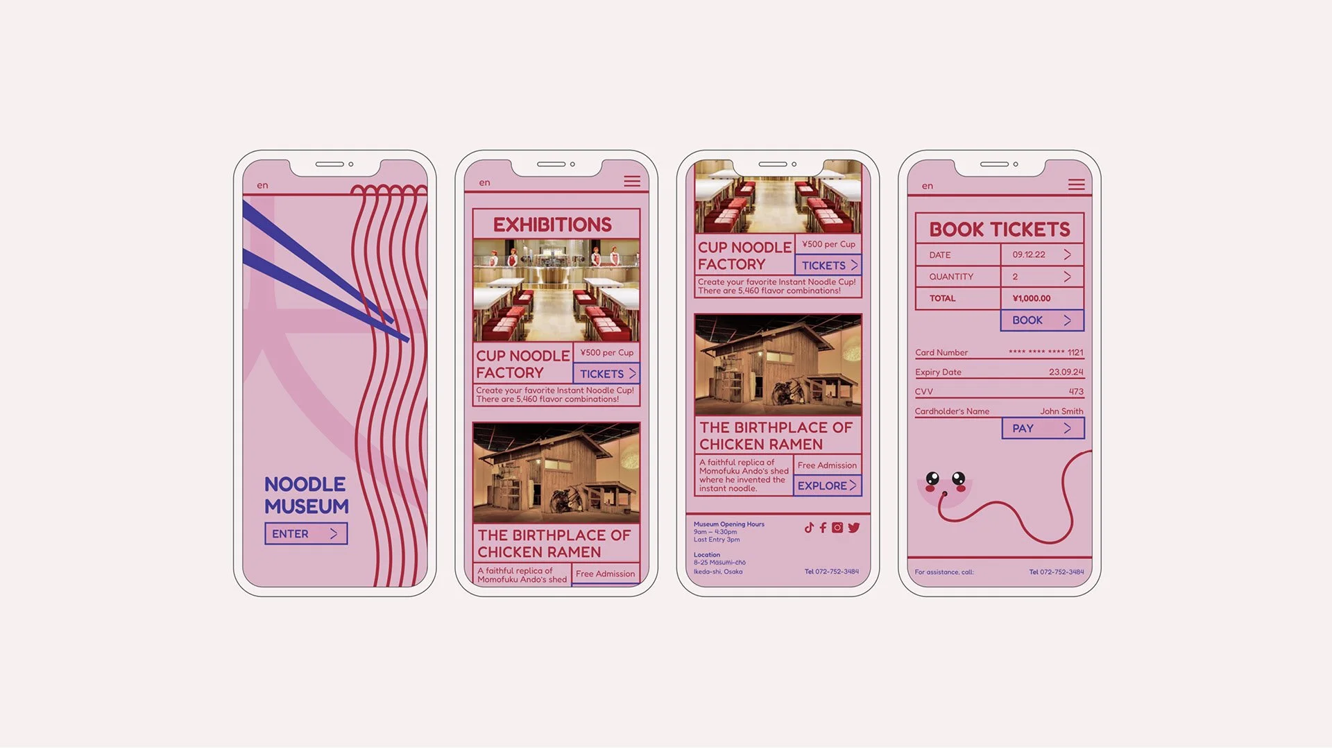
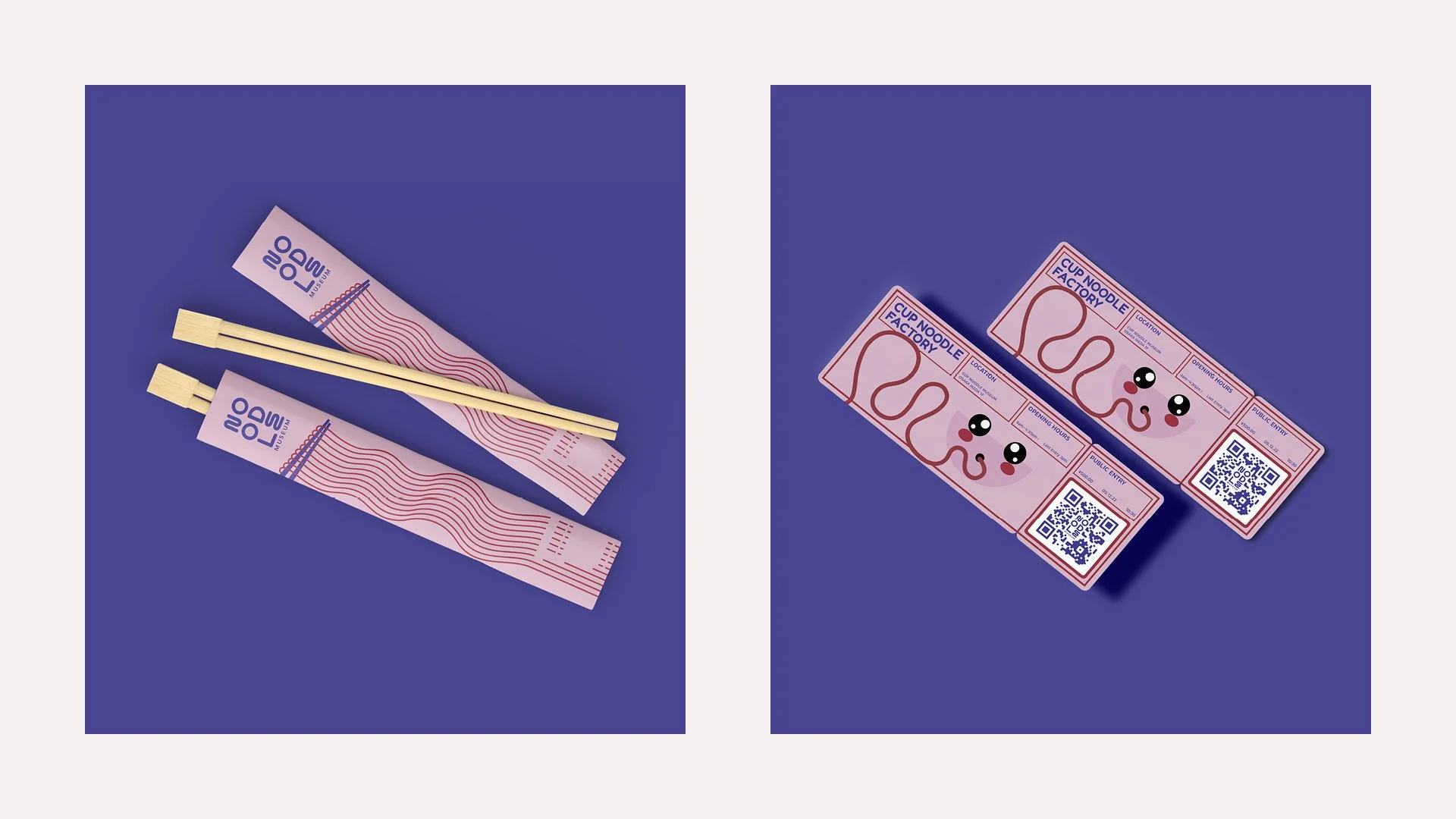
The Noodle Museum, based in Osaka, Japan, is a popular tourist destination dedicated to the inventor of instant noodles, Momofuko Ando, and the iconic Cup Noodle Factory.
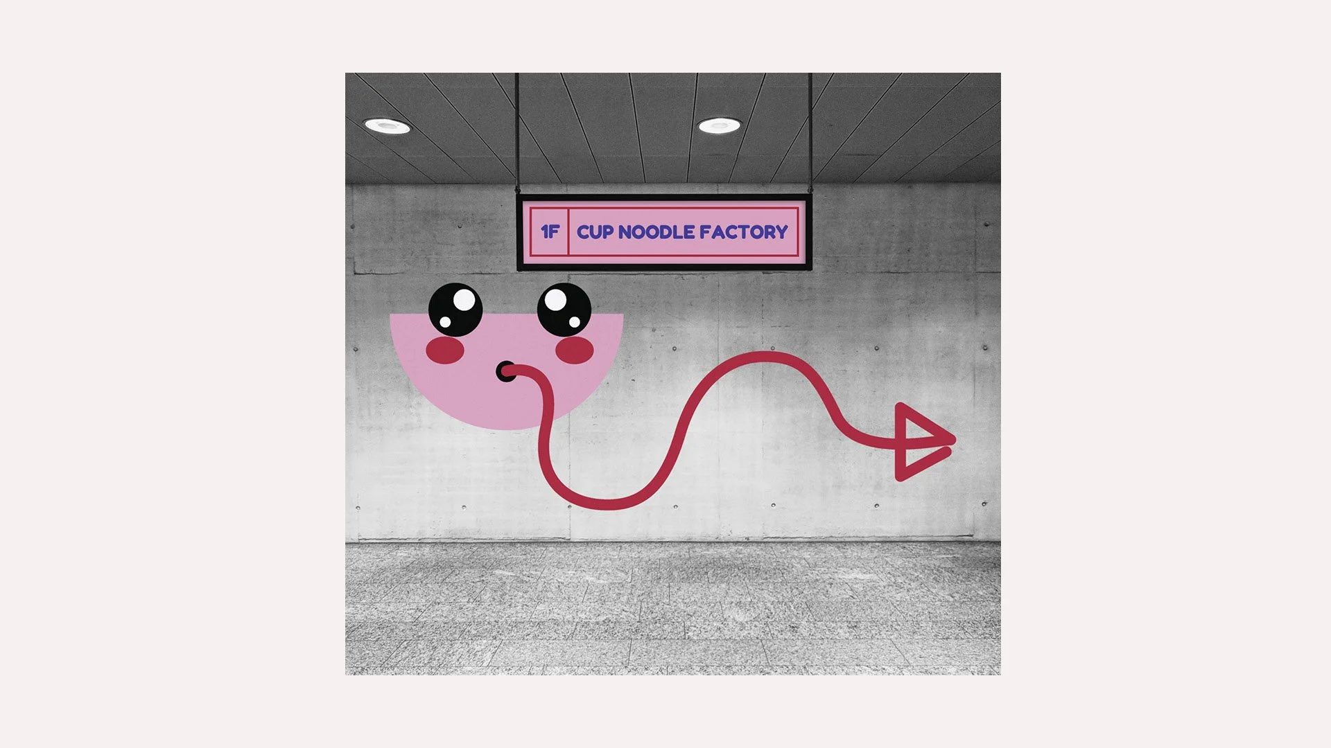
As Japan reopens to tourists, the Noodle Museum needed a fresh identity that paid homage to its heritage as well as a sense of contemporary playfulness.
The Solution
Taking inspiration from retro Japanese posters and menus, the new museum identity has a clean layout and limited colour palette, allowing for playful noodle graphics with elements of Kawaii design to take centre stage. A new logo mark combines a rounded typeface with noodle-esque letter forms, which are carried through the headings and graphic elements.
T-LAB Digital Profile
The Brief
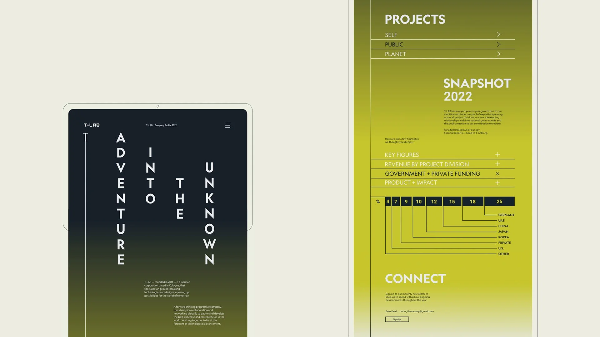
T-LAB is a German corporation who specialise in advancing ground-breaking technologies, exploring where science and technology can take us.
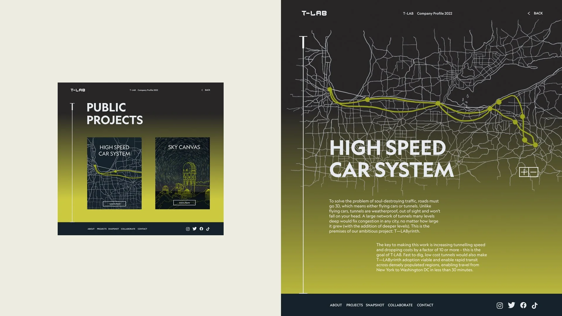
They need a digital profile, suited to multiple devices, that will capture the interest of potential investors as well as create a sense of wonderment for the general public of what might be coming on the horizon of technological advancement.
The Solution
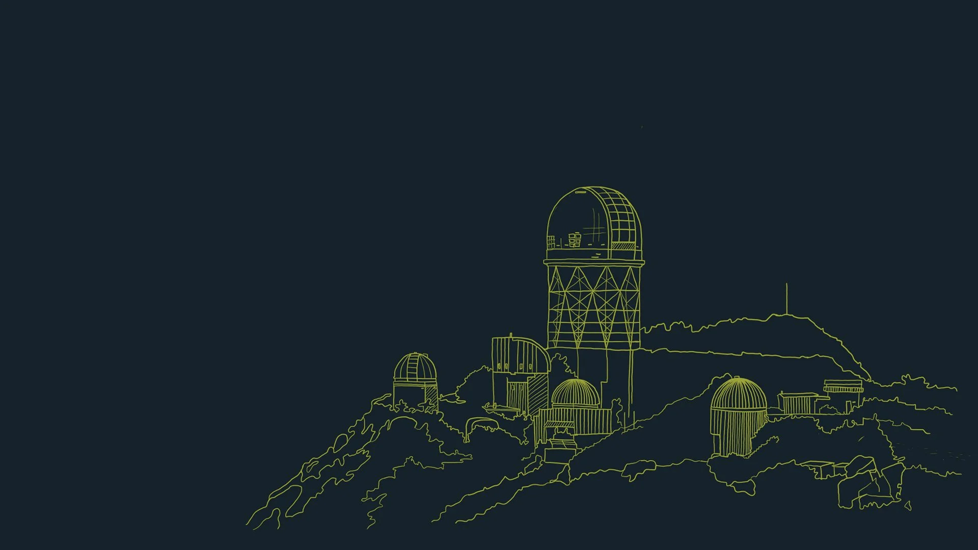
The digital layout for T-LAB starts with a dark and moody landing page that encourages the reader to scroll down to discover more. As they explore, the website transitions into a bold, adventurous colour. Paired back styling and negative space give the website a sophisticated and confident feel, essential for encouraging those investors with deep pockets.
Inferno - Book Cover
The Brief
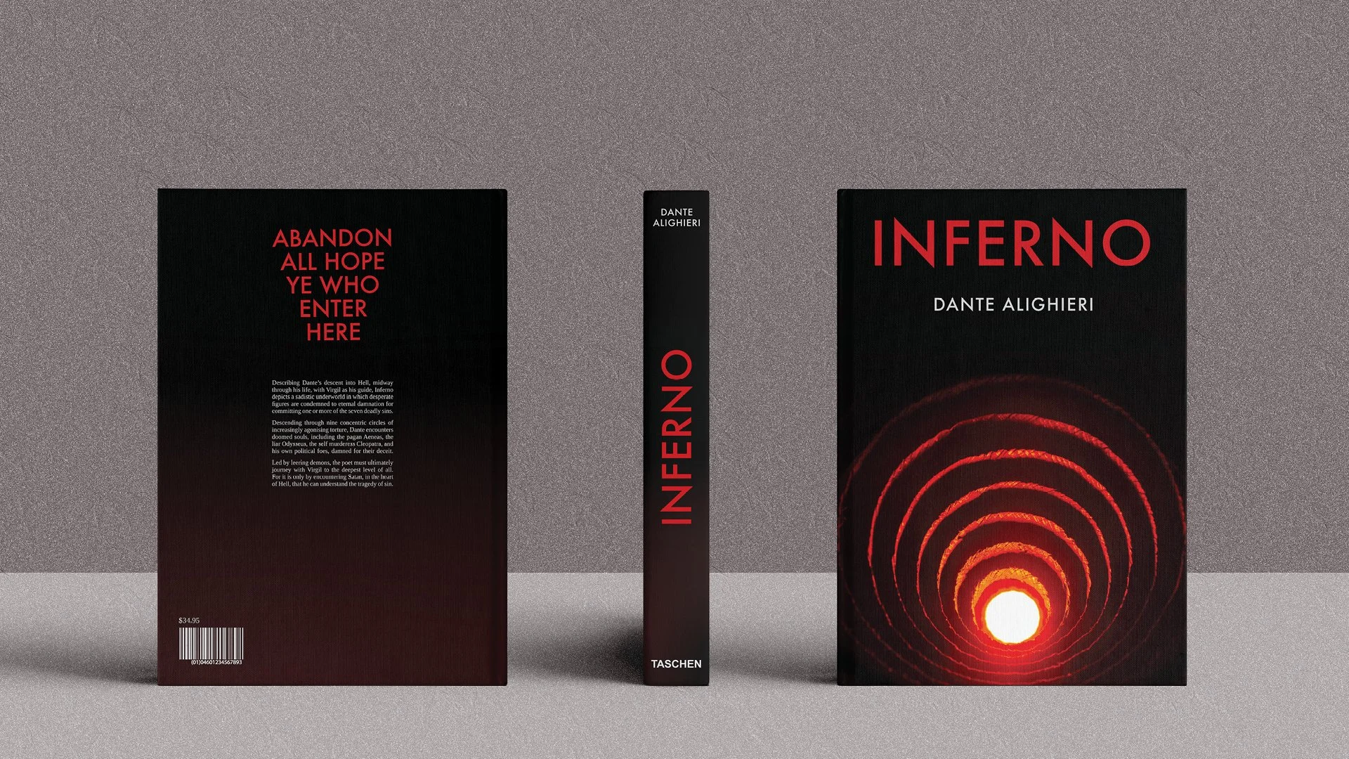
A new book cover design for Dante's epic 14th Century poem 'Inferno'. With Virgil as his guide, Dante journeys down through the nine circles of hell; each circle reserved for the doomed souls who have committed ever more grievous crimes against God.
The new cover design needed to draw new readers, outside of the world of academia, into picking up this piece of historical literature.
The Solution
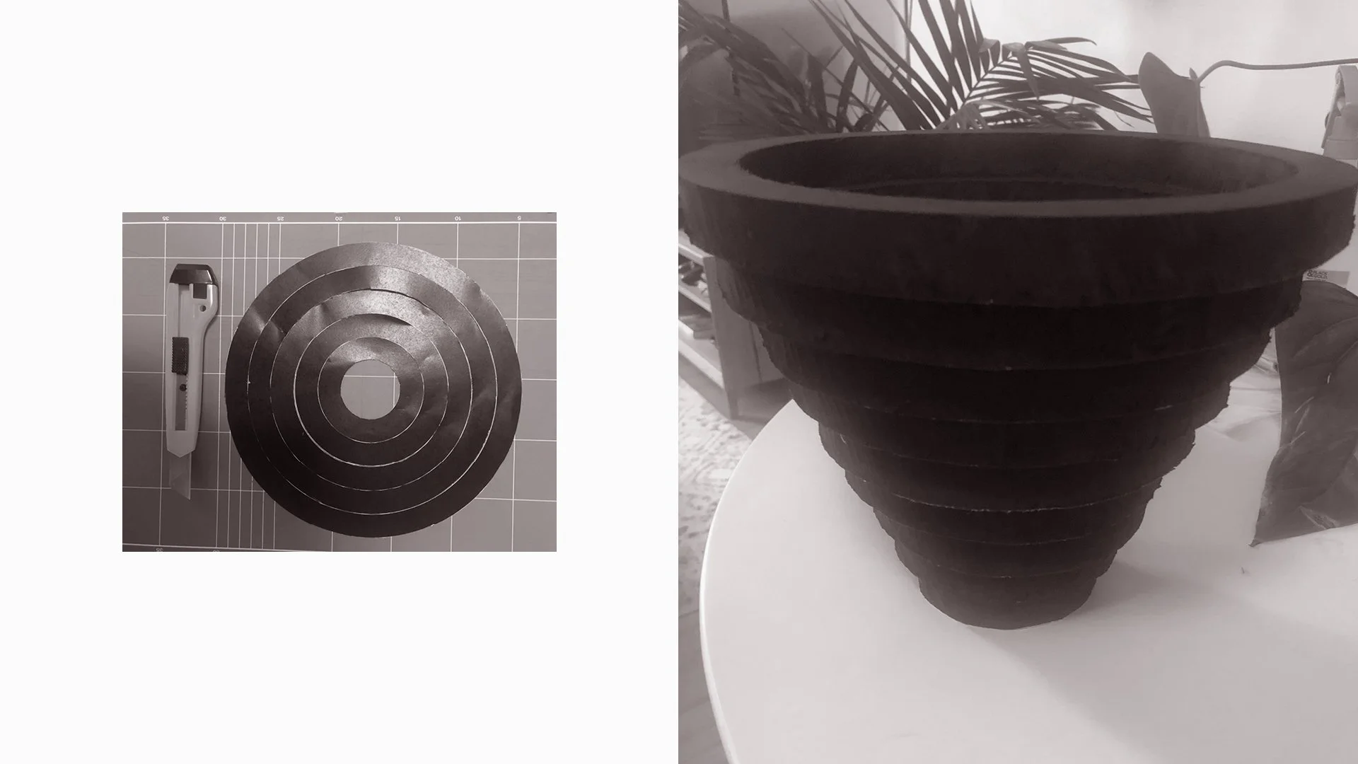
Using physical materials and strong lighting to create an interpretation of the nine circles of hell, the cover image gives an eerie perspective of looking down into the furnace, drawing the reader in. Keeping the typeface bold, but clean, allows the image to be the hero feature.
